Thursday, October 27, 2011

He's So Fluffy


Haven't been able to stop drawing this guy since I came up with him! Might be because I have a bit of a fondness for top-heavy characters - I tend to find them more fun to draw.

Wednesday, October 26, 2011

A Strange Train Of Thought


So today during my screenwriting class I was doodling as always (it helps me concentrate, honest!) and drew some weird little… bug-like thing that I made up off the top of my head. Then I noticed it sort of looked like a guy wearing the head of some sort of bird thing as a helmet or something. That then prompted me to draw a few more pictures of it, then start to give it a body…


And then when I got home... this happened.


And then subsequently, this. I'm not sure what it is, where it's from, what its name is or how and why I even came up with it in the first place, but I kind of like how it looks. I might just be drawing this guy again in the future. :P

Tuesday, October 11, 2011

I Hope You Weren't Planning On Doing Something Today...


Another drawing of my "bad side" character. Her design is pretty much finalised now (although I might need to make a few tweaks here and there to make her easier to animate), but I'm still a bit iffy about her colour scheme, so that will possibly change at some point.

Come To The Dark Side

Been a while yet again since my last update! Still, I'm back at uni now, so my posts will most likely get more frequent as I get further into my course.

The biggest change that's occured since my last update is the fact that I am now in possession of a tablet, which has made digital art much easier to do - shading and whatnot used to be a very awkward process (especially when I had to shade large areas) since I had to use my laptop's trackpad to do it all. It's also nice to be able to just draw straight into the computer without having to faff about with scanning and adjusting levels in Photoshop and erasing lines that didn't quite get rubbed out properly while I was sketching and all that.

Anyway, part of our course this year will involve an animation featuring ourselves (placed in an environment via a greenscreen) interacting with our "good" and "bad" sides, which can be based on a number of things, such as our traits, what we wish we were like, what our opposite would be etc.

Here are a few concept sketches I did while coming up with my "bad side" character.


I actually find sloths a little bit creepy for some reason, but I wanted one as a character anyway. This one represents my laziness.


This one… I’m not actually sure where I was going with this one, to be honest. I wanted a character based on my horrible procrastination problem, and so decided to have one that is the cause of said procrastination. Tempting people with TV/video games/internet etc. etc. etc. when they’re trying to work and all that.

The snake thing was far too elaborate though, so I started to go for a slightly simpler and more humanoid shape, as shown on the right.


By this point I already had the basic idea of what I wanted to do for my animation: I’m trying to do my work, and my “bad side” is trying to distract me from said work, telling me I can “always do it later” or something. I had this mental image of the character’s arms stretching offscreen and pulling back a laptop or something out of hammerspace and found that pretty amusing, which is why I gave this design long arms (which get a bit more elaborate in later drawings).


Quick (inconsistent) turnaround of my sloth character, and then a little doodle of her and my other robot character.


More of my robot character, who I still need to name. Here you can see her arms are quite a bit longer, but I’ll most likely make them retractable so she’s not dragging them around with her all the time.


My robot character at work - preventing other people from doing work. :P


She'd been grinning creepily in nearly every drawing so far, so I decided to see what she’d look like when things aren’t going her way.


And last but not least, a bit of foreshortening practice and silly expressions.

Thursday, July 28, 2011

Burn Baby Burn


While browsing the audio section of Newgrounds one night, I came across this little piece. While listening to it I got mental images of Heatman from the Megaman series looking all cute and innocence while surrounded by all this destruction he's caused, so I decided to draw it. I'm not entirely sure why I got those mental images, and there is a reason it was Heatman of all things, but I won't go into that right now.

This was my first attempt at shading an image with the light source coming from behind. My first try was as follows:


I hadn't quite completed the shading at the time, but I decided to show it to a few friends of mine anyway and they gave me a few pointers about where the lighting should and shouldn't be. One of them suggested making the front more interesting by adding highlights from the glowing gem, which I liked the idea of since I've always wanted to try using green highlights. This was how it looked after I'd tweaked the shading:


I'm glad I decided to get an opinion on it before finishing it off, because I think the second try is vastly better than the first.

Tuesday, July 26, 2011

Another Updated Appearance


Changes in appearances seems to be a recurring thing with me, although most of the time it's unintentional on my part and often happens gradually. Here however, I decided it was finally time to make my character, Wassat, look less like some sort of reject Megaman boss and more like... something that isn't a reject Megaman boss. I'm not quite sure if I managed to pull it off and I'm still most likely going to be tweaking his design in the future, but for now I'm pleased with his new appearance.

In other news, my new sketchbook doesn't seem to scan very well.

Friday, July 15, 2011

KangaRuse


So my character, Ruse, has been... some strange indeterminate species for some time now, so I figured it was about time I fixed that. The animal he seemed to resemble the most (and that was most frequently suggested to me) was a kangaroo, so I modified his tail a little and found that I actually liked how that looked. So now, he is a kangaroo.

...I find it amusing that I keep drawing him not acting like how he's actually supposed to act. He's kind of meant to be a bit of a psychopath. :P

Tuesday, July 05, 2011

Anyone Want A Hug?


I was having one of those days where nothing I drew was turning out right, so I did what I often do in that sort of situation - make something up as I went along, not really caring if it looks right or not.

This time however, it turned out a little creepier than initially intended. :P

Monday, July 04, 2011

Bird Brain


It was my brother's 17th birthday a few days ago, so I drew him a picture of one of his characters, named Rhys, as a present. It's been a while since I inked and coloured something traditionally, and honestly, I think it shows. I've just gotten used to digitally colouring sketches. He's supposed to be more of a grey-ish colour, but the reference picture I had when I was drawing this was fairly old, so he ended up much more blue than he's meant to be.

But anyway, the reason he looks so sour is because he can't fly. And also because he was initially supposed to be a magpie but ended up looking very little like one, which has resulted in an inside joke between my brother and I in which other characters are constantly getting his species wrong, calling him things like "the pigeon" or "the parrot" or "the wagtail".

Saturday, June 18, 2011

"Everything Belongs To Me"


A bit more fanart, this time of Mercury from Megaman V for the Gameboy. This was a good opportunity to experiment with the shading, since my lightsources always seem to be coming from the right, so having it more towards the centre instead was fun to do.

Here are some early versions of the image, before and after I started adding the shading:


Monday, June 06, 2011

Quick Sketch


Ouch, has it really been almost a month since my last post?

Anyway, to show I'm not completely dead, here's a quick doodle (pun not intended) of Quickman from the Megaman series. This started out as a bit of practice with drawing different head shapes, then I started experimenting to see if I could still do pencil shading (something I haven’t done in a while), and then I started mucking about with it in Photoshop and this was the result. I didn't have access to my scanner at the time, so I had to take a picture of the sketch with my phone, so the quality's not great.

Wednesday, May 11, 2011

Ssssso Nice To Sssssee You


One of my robotic reptillian characters, Rensis, who I believe I've mentioned in a previous post. I'm not too fond of his colour scheme at the moment so I'll most likely be changing it at some point.

The section that separates his hood from the rest of his body is where his "venom" is stored, and the tubes coming from it link up to his mouth and subsequently his fangs, which are retractable. His venom messes with the internal workings of other robots and causes them to malfunction, but he only bites others in emergencies. Personality-wise he's irritable and prefers to keep to himself, and doesn't seem to care much for his cocky younger brother and his high-strung younger sister.

Because I'm always changing things he looks quite a bit different to my earlier drawings of him, which I shall be sharing below.


This was the last picture I drew of him before this one. I didn't really like how his "hood" was looking and it was a little awkward to draw, so I ended up changing it to how it is now. My original idea was that he had a weapon of some sort concealed in it (most likely a large laser), but I ended up deciding that would probably end up making him a little top-heavy, so I scrapped that idea.


These are some fairly early drawings of him. As you can see his hood is much smaller here, but I gradually started to make it larger, to make him seem a little more intimidating. Here he's shown with his younger brother Wassat, who looks like this now:


I'm thinking of tweaking Wassat's design even more than I already have done since I first drew him, in particular his armour and his feet. He was the first robot character I designed and I was heavily influenced by the Megaman series of games, but a few people have noted that the influences are a little too obvious, so I want to make them a bit more subtle.


And last but not least, just so you can see just how much he's changed over the course of a year, this was one of my very first drawings of him.

Tuesday, May 03, 2011

Flyin' High


For my course, I had to do a series of short stop-motion animations to help reinforce my understanding of the principles of animation. I ended up making a small robot cut-out puppet, and one of the tasks involved making him jump on a trampoline - this was the result. I still have a few more animations to finish and then I'll be compiling them all into a single video, but I quite like how this one turned out, so I decided to share it anyway.

Saturday, April 30, 2011

Yet More Zombies


I seem to have been neglecting this blog a little recently, so have another adorable picture of Zombie to make up for it.

Still having fun with coloured outlines.

Friday, April 22, 2011

Cuteness Overload


For some reason I was stricken with a strange urge to draw adorable kiddy versions of some of the bosses from Megaman 2 for the NES. And... so I did.

Now if you'll excuse me I need to go inject my sketchbook with insulin.

Zombie and Dirk


Just a couple of doodles of some of my characters. As you can see I'm having fun with the whole "coloured outlines" thing.

I don't recall if I've posted any pictures of her as of yet, but Dirk is Chip's boss, and is a mechanic, though something of a paranoid one. This has only recently been decided however, so his appearance will be tweaked slightly to reflect this (it would be quite strange if his feathers were always so clean and pristine... unless he has an OCD about cleanliness or something).

It sorta look as though Dirk is confused and disturbed by the Zombie floating next to his head. This was completely unintentional but it's amusing anyway.

Monday, April 18, 2011

'Bots From Spaaaaaace


Now that my deadlines have been and gone and I have no more work to do for the next week or so, I can start spending a bit more time on my drawings without feeling bad about it. :P Anyway, this is just a little bit of fanart of Sunstar and Terra, two of my favourite characters from Megaman 5 for the Gameboy. I decided to experiment with doing coloured outlines for this one and I love the look it gives, so that's something I'm probably going to play around with more in the future.

More Sculptures

Here are some pictures of the various stages of my robot sculpture. Due to a lack of clay I had to tweak his design a little from what it was originally, but I guess it still somewhat resembles the original sketches I did of him. I decided to leave the wire skeleton exposed for the arms and legs, as they sort of went with the look.


And here is a closeup of my zombie sculpture:

Tuesday, April 12, 2011

Just One Cornetto... Or Should That Be Spaghetti?

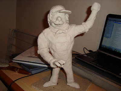
For our first sculpture assignment, we were given a random description and asked to create a character design based on it. My particular description was "Giovanni the opera-singing Italian dustman".


Here are a few early sketches I did whilst doing a bit of research on the stereotypes of the various aspects of Giovanni.


This was the design I ended up coming up with, which is a bit of a mish-mash of the previous sketches.

Here are a few photos from when his sculpture was still in the early stages:


And here's the final product:


I quite like how he turned out, considering this was my first ever sculpture. I think his arms could do with being a bit shorter though.

Monday, April 11, 2011

Little Nippers - Finalised

Finally got my animation finished and edited in iMovie today. Overall I'm quite pleased with the results, though I'm not too fond of the sound effects. The soundtrack is a little something I threw together in a program called Mixcraft (which is essentially a Windows version of Garageband), and at first I was skeptical about how it sounded, but I think it works quite well with the animation.

While I was putting it together I realised I'd accidentally set the Toon Boom file to have a resolution that wasn't HD, so when I changed it I had to move things back into the right places, which is why some of the positions may look a bit different to how they do on my older videos.

Little Nippers - Title


The title image I created for my 15 second intro to a children's cartoon. It was originally varying shades of the same colour, but this made the letters blend into each other a little too much, so I made the differences a little more drastic so that each individual letter stood out more.

Bird Brain


Hoopoes are one of my favourite kinds of birds. They just have such a gorgeous colour scheme and I just love their overall appearance, especially that distinctive crest of theirs. So it's only natural that I'd base a character on one at some point.


This particular character started off as a doodle I did on the back of a quiz sheet in the lounge on campus earlier today. I had no intentions of making a new character when I drew him, but I kinda liked how he looked, so when I got home I drew him again, only a little more seriously.


This was the result. I'll probably change his head a little as I'm not entirely pleased with it, but apart from that, he's quite fun to draw. He doesn't have a name just yet, but I'm leaning towards "Dirk".