Saturday, April 30, 2011

Yet More Zombies


I seem to have been neglecting this blog a little recently, so have another adorable picture of Zombie to make up for it.

Still having fun with coloured outlines.

Friday, April 22, 2011

Cuteness Overload


For some reason I was stricken with a strange urge to draw adorable kiddy versions of some of the bosses from Megaman 2 for the NES. And... so I did.

Now if you'll excuse me I need to go inject my sketchbook with insulin.

Zombie and Dirk


Just a couple of doodles of some of my characters. As you can see I'm having fun with the whole "coloured outlines" thing.

I don't recall if I've posted any pictures of her as of yet, but Dirk is Chip's boss, and is a mechanic, though something of a paranoid one. This has only recently been decided however, so his appearance will be tweaked slightly to reflect this (it would be quite strange if his feathers were always so clean and pristine... unless he has an OCD about cleanliness or something).

It sorta look as though Dirk is confused and disturbed by the Zombie floating next to his head. This was completely unintentional but it's amusing anyway.

Monday, April 18, 2011

'Bots From Spaaaaaace


Now that my deadlines have been and gone and I have no more work to do for the next week or so, I can start spending a bit more time on my drawings without feeling bad about it. :P Anyway, this is just a little bit of fanart of Sunstar and Terra, two of my favourite characters from Megaman 5 for the Gameboy. I decided to experiment with doing coloured outlines for this one and I love the look it gives, so that's something I'm probably going to play around with more in the future.

More Sculptures

Here are some pictures of the various stages of my robot sculpture. Due to a lack of clay I had to tweak his design a little from what it was originally, but I guess it still somewhat resembles the original sketches I did of him. I decided to leave the wire skeleton exposed for the arms and legs, as they sort of went with the look.


And here is a closeup of my zombie sculpture:

Tuesday, April 12, 2011

Just One Cornetto... Or Should That Be Spaghetti?

For our first sculpture assignment, we were given a random description and asked to create a character design based on it. My particular description was "Giovanni the opera-singing Italian dustman".


Here are a few early sketches I did whilst doing a bit of research on the stereotypes of the various aspects of Giovanni.


This was the design I ended up coming up with, which is a bit of a mish-mash of the previous sketches.

Here are a few photos from when his sculpture was still in the early stages:


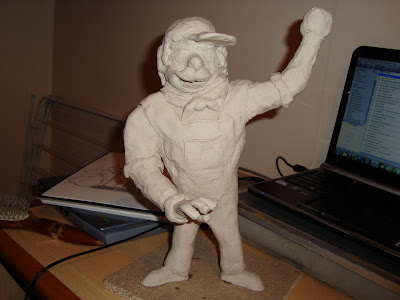
And here's the final product:


I quite like how he turned out, considering this was my first ever sculpture. I think his arms could do with being a bit shorter though.

Monday, April 11, 2011

Little Nippers - Finalised

Finally got my animation finished and edited in iMovie today. Overall I'm quite pleased with the results, though I'm not too fond of the sound effects. The soundtrack is a little something I threw together in a program called Mixcraft (which is essentially a Windows version of Garageband), and at first I was skeptical about how it sounded, but I think it works quite well with the animation.

While I was putting it together I realised I'd accidentally set the Toon Boom file to have a resolution that wasn't HD, so when I changed it I had to move things back into the right places, which is why some of the positions may look a bit different to how they do on my older videos.

Little Nippers - Title


The title image I created for my 15 second intro to a children's cartoon. It was originally varying shades of the same colour, but this made the letters blend into each other a little too much, so I made the differences a little more drastic so that each individual letter stood out more.

Bird Brain


Hoopoes are one of my favourite kinds of birds. They just have such a gorgeous colour scheme and I just love their overall appearance, especially that distinctive crest of theirs. So it's only natural that I'd base a character on one at some point.


This particular character started off as a doodle I did on the back of a quiz sheet in the lounge on campus earlier today. I had no intentions of making a new character when I drew him, but I kinda liked how he looked, so when I got home I drew him again, only a little more seriously.


This was the result. I'll probably change his head a little as I'm not entirely pleased with it, but apart from that, he's quite fun to draw. He doesn't have a name just yet, but I'm leaning towards "Dirk".

Saturday, April 09, 2011

A Blast To The Past

I'm not entirely sure why, but I felt compelled to get the sprites of the boss characters from the second Megaman game for the NES and revamp them, so that they resemble their official art more.


Above are the original sprites, and below them are my revamps. Even though I did them on a whim, I like how they turned out.

Thursday, April 07, 2011

Monster-y Goodness


Not really sure what this is, since I made it up as I went along.

Posting this right after my cute dinosaur animation is a bit of a weird contrast.

Wednesday, April 06, 2011

Little Nippers, Scene 2


Here's what I have so far for the second scene of my short intro animation. This is still a WIP and there are many things I need to tweak (such as Samantha's stiff arms when she walks) and add (the title, for one thing), but I decided to upload what I have so far anyway because I like how it's turning out. I'm particularly pleased with Oliver's movements; his moveable spines really help emphasise his emotions, and he was met with many an "awwwwww" when I showed this to my friends.

Monday, April 04, 2011

Little Nippers, Scene 1


Finished off the first scene for my 15 second children's animation. This originally started off with a closeup of the background and panned forwards until it was all in view, but this added an unnecessary 4 seconds, so I cut that part out so that I'd be able to do more with the second scene.

This particular scene is now pretty much done. I'll be adding sound effects and a music track once I've finished off the second scene and got it all together in iMovie.

Karma Chameleon

I have yet to post drawings of them here, but I have two robotic reptillian characters, named Wassat and Rensis. The former doesn't really resemble a particular species and the latter is based on a cobra, and I randomly decided to throw another character into the mix, this time a chameleon.


She doesn't have a name yet and this is just an early look for her, so no doubt she'll look completely different within a week or so knowing me. I'm most likely going to make her design a little less complicated. A friend of mine pointed out that the patterns on her shoulder plates made it look as though there was a tiny city inside of her, which was not the intention, but that's kind of a cool idea. Not sure if I want to use it or not, though.

Oddly enough, I got the inspiration for her whilst driving behind a Ford Ka and seeing the rearlights.

Sunday, April 03, 2011

Rowf!


This is Zombie, one of my oldest characters. As his name and appearance suggests, he is an undead, dog-like lizard... thing. Looking at that description, it seems odd that he's as adorable as he is. He's actually changed quite a lot over the years. This is how he used to look, way back in 2005:


I'm not quite sure how he changed so dramatically, but I seem to have a habit of constantly tweaking things about my characters, sometimes without even realising it.

Saturday, April 02, 2011

Robot Rock

Here are a couple of concept designs I came up with for my future robot sculpture. We were allowed to do pretty much whatever we wanted within reason, although my tutor suggested working with silhouettes and offered a box full of pieces of card cut into different shapes. I took a handful and dumped them on to the desk so they'd make some sort of silhouette and drew a few of them, then came up with designs based on them.


This was the first one. Obviously this would require far too much clay for me to be able to sculpt it, so I abandoned that idea, though I'm rather fond of it.


The second one. I really don't know what I was going for with this one and just kinda got silly with it halfway through because there was no way I was going to be able to sculpt that. It looks like some sort of demon chicken robot or something.


The third one, and the one I eventually ended up deciding on. The look on the far right is the one I'm going to be sculpting, which will be nice and easy to do as the little guy's so skinny.

More Concepts and Early Animations - Oliver


After coming up with Samantha's initial design, I decided she needed a buddy of some sort, and got to work doodling up various dinosaurs. The one that seemed to be the most popular (and that was my personal favourite as well) was the Stegosaurus, and he went on to become Oliver (they grow up so fast).


A couple more doodles later and I'd settled on a look for him, and a personality as well. I decided to muck about with his spines a little, and made it so they moved back when he was scared.


This was his first rig, though it suffered a lot of the same problems as Samantha's original one. His legs where also only made up of two parts, which made making them move rather tricky, as seen in his first test animation.

Lineless Ruse


I enjoy doing lineless pieces as they're fairly quick and easy to make, so I did one of one of my favourite characters of mine, Ruse (he isn't usually this short, though). I'm quite pleased with how this turned out, considering it started off as a silly little doodle in my sketchbook. This was the first time I'd added a texture to a lineless piece of mine, and I think it goes with the style well.

Samantha - Early Animations


This was the first ever test I did with Samantha's old rig. It's nothing too special as I was mostly getting adjusted to the software, but having never done this sort of thing before, I liked the results anyway.


It was after I tried to do a walk cycle that I decided that redoing her rig would be a good idea, as the gap problem mentioned in my previous post made this fairly tricky to do.


This was the first test I did with her new rig, which was much more expressive than her old one. This one had three interchangeable heads, could blink, move her pupils, show either the back or palm of her hands, and move her claws (though this isn't shown in this particular test). I was also happier with this one aesthetically, as it was much less flat than before.


Though this was mostly me having fun with the camera (obviously the movements will be less... elaborate in the final piece), this is a good example of how much more expressive Samantha's new rig was.

Some Concepts - Samantha


These were the first drawings I did of Samantha. As you can see she doesn't look a whole lot different to how she does now. Ordinarily I go through a fair amount of concept designs before I settle on something I like, but with Sammy it just came almost instantly (although that might be partly because I based her on an existing character of mine). My tutor suggested changing her feet as they looked a little too much like hooves, and also to perhaps modify her hands a little so they could show a little bit more emotiveness.


After tweaking her look accordingly, this was her first rig. However, it was fairly limited in that her pupils were permanently fixed in the same place and she couldn't blink, and the way I'd made her parts meant that if she bent her legs a certain way, there would be a triangle-shaped gap.