And now back onto my uni work. After a bit of feedback on my initial animatic during rushes, and then subsequently on my second one (which I have yet to post) I got a few new ideas to help flesh out the story a little. Basically, I needed to focus more on the character’s motivations - why does Tlun not seem to want Zombie around? Why does Biscuit come to rescue him? Why do Zombie and Biscuit follow him into his hut? Things like that.
One of the solutions was to add some sort of scene at the beginning, showing Zombie and Biscuit traversing the snowy wilderness. This was a good opportunity to clarify that Biscuit acts as Zombie’s mother, which I'll be showing by having her licking and nuzzling him like a mother dog, and also carrying him in her mouth by the scruff of his neck.
As for why Tlun wants them out, the entrance to the village will be shown more prominently, with a few crude signs saying to stay out, etc. Most of the scenes I already had will most likely still be incorporated, but there’ll be a few new ones added too. I’m also going to clarify that it’s starting to get dark out when Tlun gives up and goes back to his hut, with a scene that shows Zombie and Biscuit looking out at the cold, dark wilderness, hearing a few howls and cries of predators in the distance, before they decide to follow Tlun.
Basically, there’s more of a motive now - Biscuit is trying to retrieve her pup, while Tlun is trying to get them both out.
Another thing I need to do is keep the pacing of the story in mind, as my second animatic (which I won't be posting until I've made the necessary modifications) kind of kept the same pace throughout, and as a result, dragged on in places. In order to solve this, I'm going to up the pace of some of the more frantic scenes (such as Tlun chasing Zombie and later trying to get him off his head), and also make the scene in which Biscuit comes to Zombie's rescue more elaborate, maybe having her actually attack him instead of just standing her ground and barking at him.
Anyway, onto drawings - these are a few pictures of Zombie and Biscuit with their heads at different angles. I'm likely going to make little clay models of their heads in order to get a better idea of how they'd look, since my animation will call for a much bigger range of angles than I usually do.
A quick sketch of Tlun. Drawing him so many times for my storyboard/animatic has helped me to solidify his proportions - he’s pretty top heavy and usually walks around on all fours, but he can stand up as well if he wants to be extra intimidating. Kind of like a gorilla in that regard.
A bit of a rough size comparison between Tlun and Zombie (who'd probably be a bit smaller than he is here). The “fuzystatic” brush in SAI is fun to mess around with. I might see if it can get incorporated into the actual finished backgrounds.
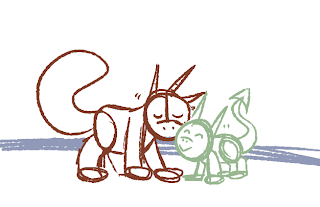
Another size comparison, this time between Zombie and Biscuit. I shrank Zombie and made him a little pudgier to sort of emphasise that he’s a puppy, and try to make it more obvious that Biscuit acts as his mother, since it apparently wasn't clear in my animatic. I'm probably going to alter the design of his head a little too, since I think having his eyes more in the middle of his face, rather than the sides of his head like a lizard, will make it easier to animate his expressions. I also might change his mouth shape so he can be more expressive with that, too.
Zombie's appearance in my storyboards/animatic is quite a bit different to how it usually is, and was mostly done that way for the sake of faster drawings - but I've found myself liking that design over his regular one for this animation. It seems like it'd be easier/more simple to work with, so here I was trying out a more simplified look for him.
I’m actually not sure whether to give him pupils or keep his eyes all black as they are in the animatic, since I kind of liked how they looked, even though it was only done as a way of finishing the drawings quicker. I don't want him to look too Tim Burton-esque, though - as he is, he's sort of bearing a bit of a resemblance to the movie Frankenweenie to me, despite being a character I've had for 8 years now. The stitches have always been a part of his design, but I might do away with them for the sake of simplification. Any suggestions?


0 comments:
Post a Comment